Urban Seed Branding
A startup company based in Las Vegas (at the time running under the name GreenCo) approached me to create a new brand identity. Though the company was in its preliminary stages, they recognized the value of having a solid visual identity in place from the beginning.
Our initial conversation was jam packed with information. We discussed topics like Hydroponic Growing, proprietary water filtration, microbes, and hydroponic greenhouses, and I'll be the first to admit that the information was rather advanced and hard for me to understand at first.
Complexities aside, the mission was clear; to supply locally grown, quality food that's affordable and sustainable. Their system increases quality and growth volumes that surpass even traditional farming, all while using less water and little to no electricity. Both company and concept aligned with my values—I was eager to get started.

Challenge 1: They disliked the original company name, GreenCo, and needed an outside perspective to help them land on a better solution. Prior to this, I had never been asked to break such a rule and come up with a completely new company name. But the challenge of brainstorming and being a part of developing the new company name proved to work well within my process, and both the task and result were very rewarding.
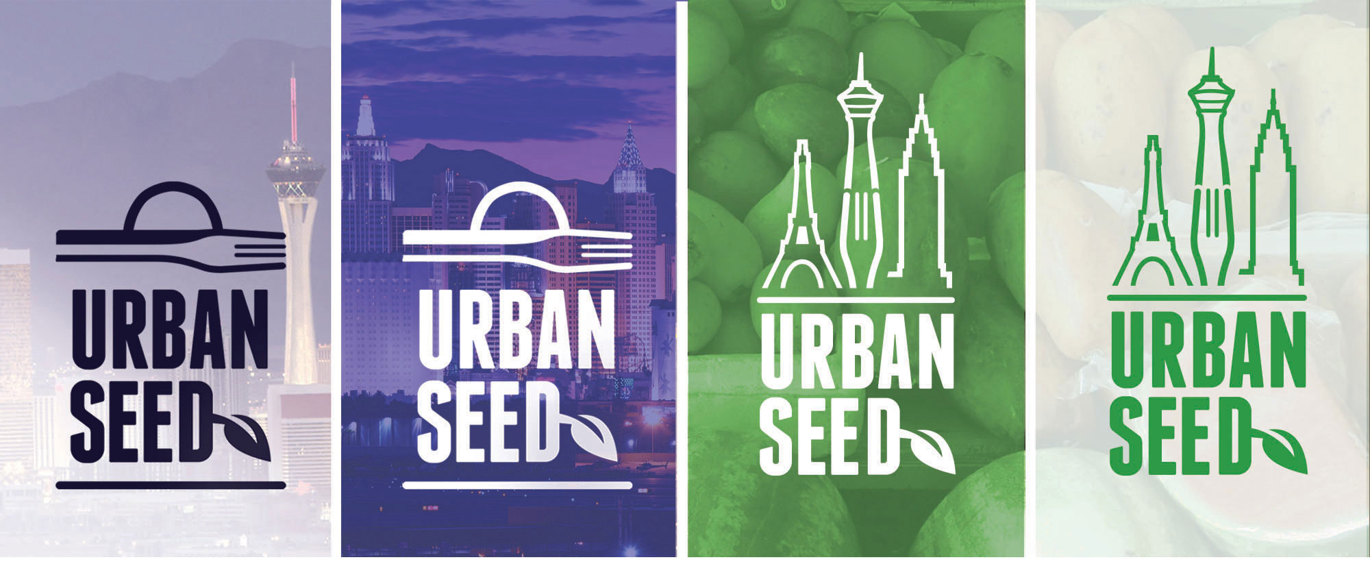
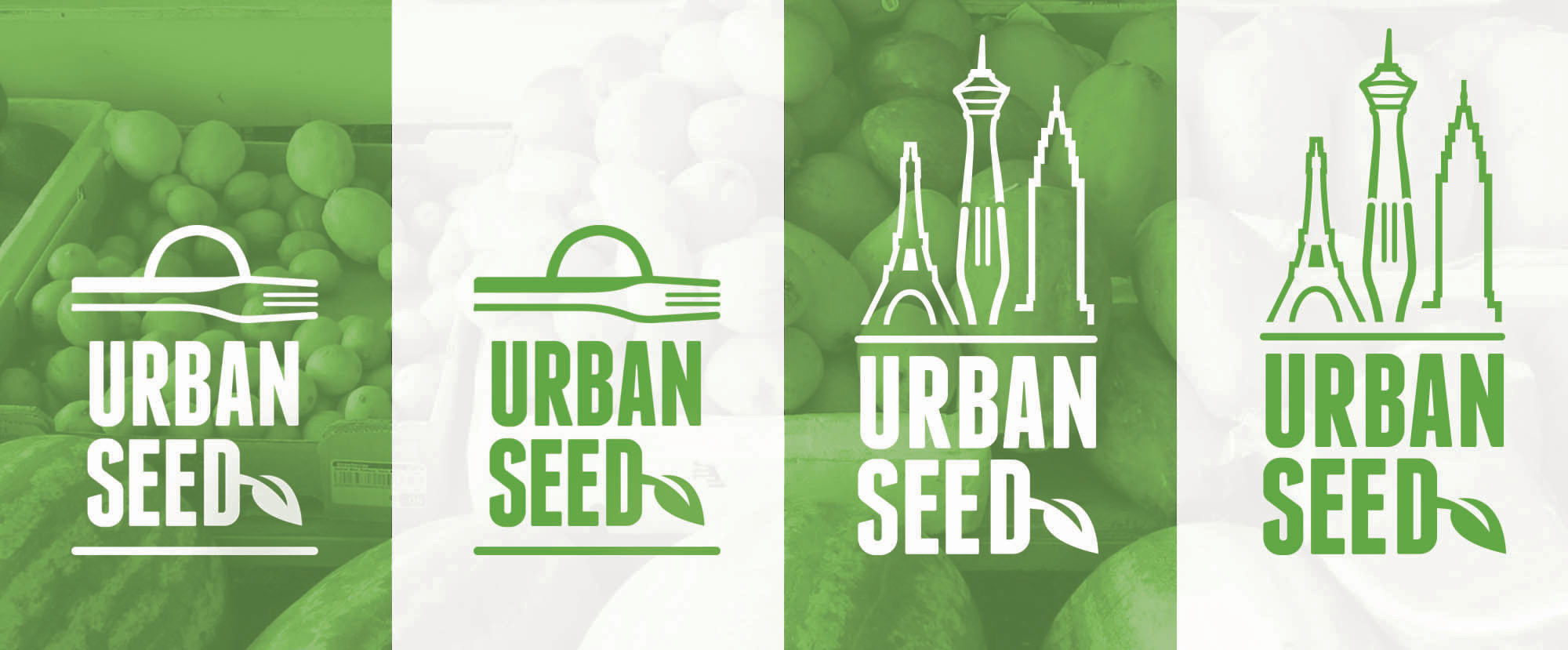
The above results provide connected options—both feel local to Las Vegas (in this context) and it is apparent they stem from the Urban Seed brand.
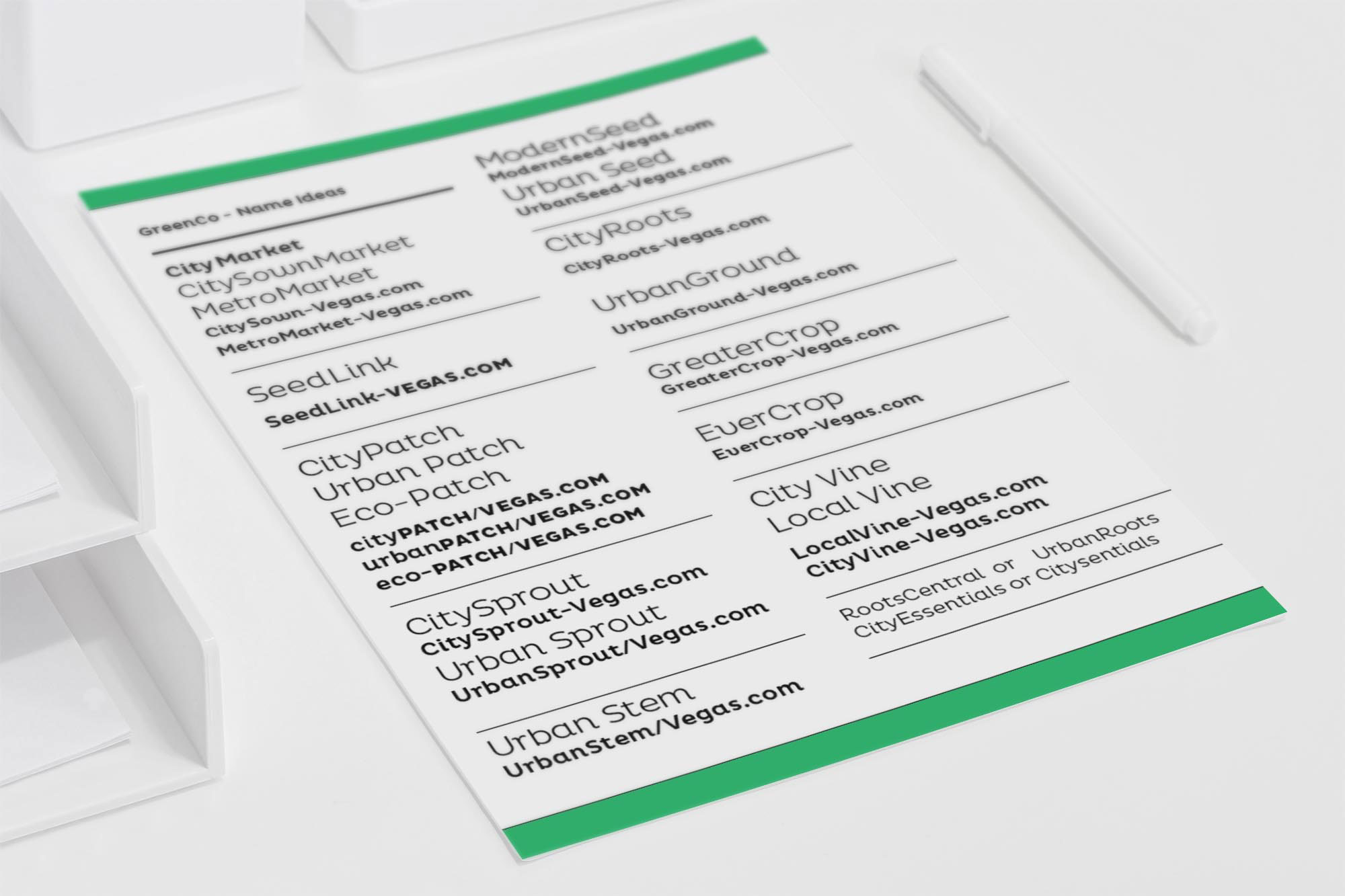
With no preconceived ideas, I researched, used countless word banks and mind maps, and drew connections between words, letterforms, and the company mission. After developing close to 100 company names, refining down to top few, the name UrbanSeed rose to the top.

Challenge 2: The logo needed to work across multiple markets. Urban Seed's primary market is Las Vegas, with plans to expand to Phoenix, other major west coast markets, and eventually nationwide. Their goal is to enter each new market in a way that feels local—yet maintain recognizable and strong ties to the Urban Seed brand. Prior to even sketching, it was difficult to consider how I could include a variable element to the logo, able to shift multiple times . . . something more than just interchanging a city name, but subtle enough to remain true to the overall brand.


