WaterFire Sharon
The client desired a logo that was unique to the city of Sharon, but remained consistent with the feeling of the event and artform. With these cues in mind, I researched the existing WaterFire venue logos to eliminate any similar ideas from my brainstorming. I watched some previous WaterFire events and lit candles near flat plates of water for inspiration while I was sketching.
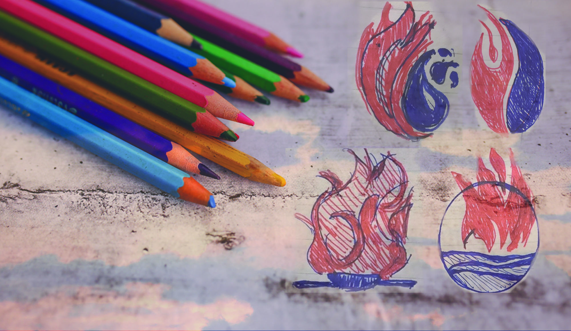
A selection of initial sketches. The curves and coil resembled that of a rose, which at first didn't seem significant until I discovered the term 'Rose of Sharon' through a conversation. I love this part of the process because you never know when an unexpected connection will reveal itself.
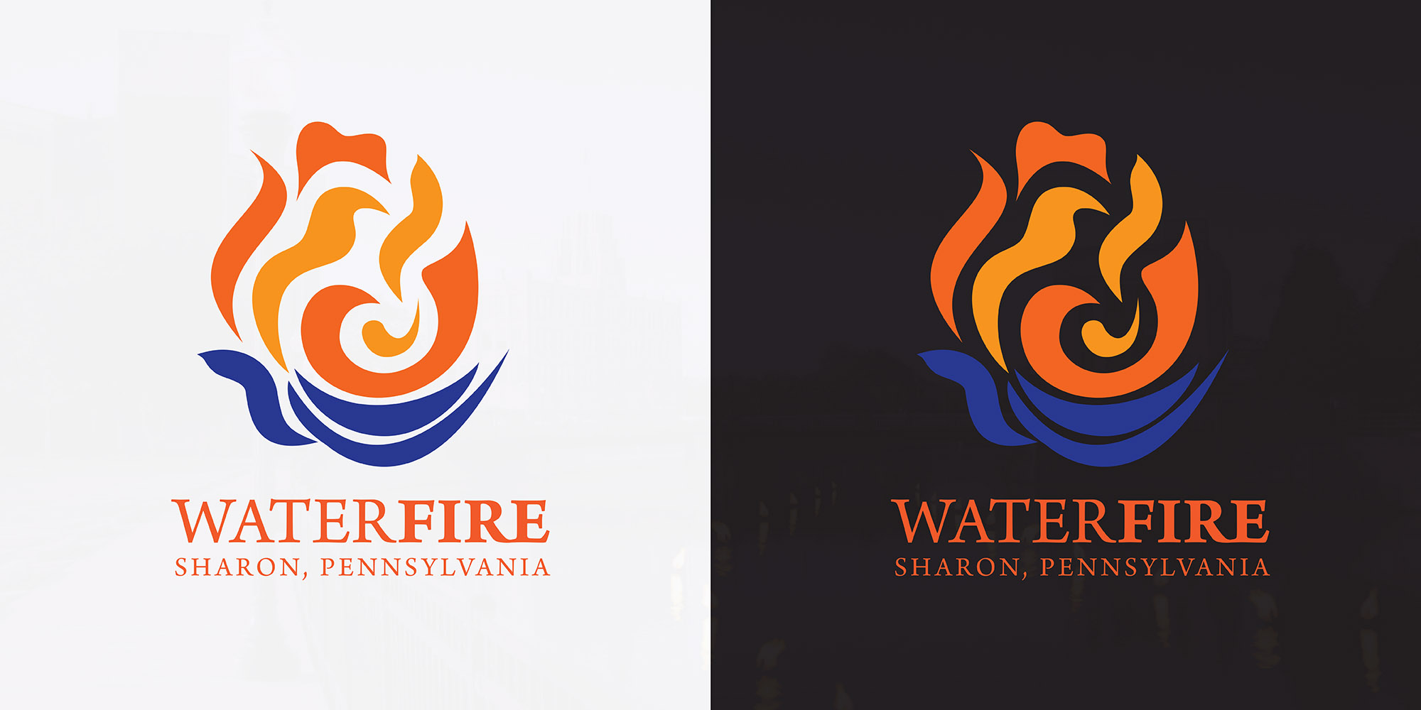
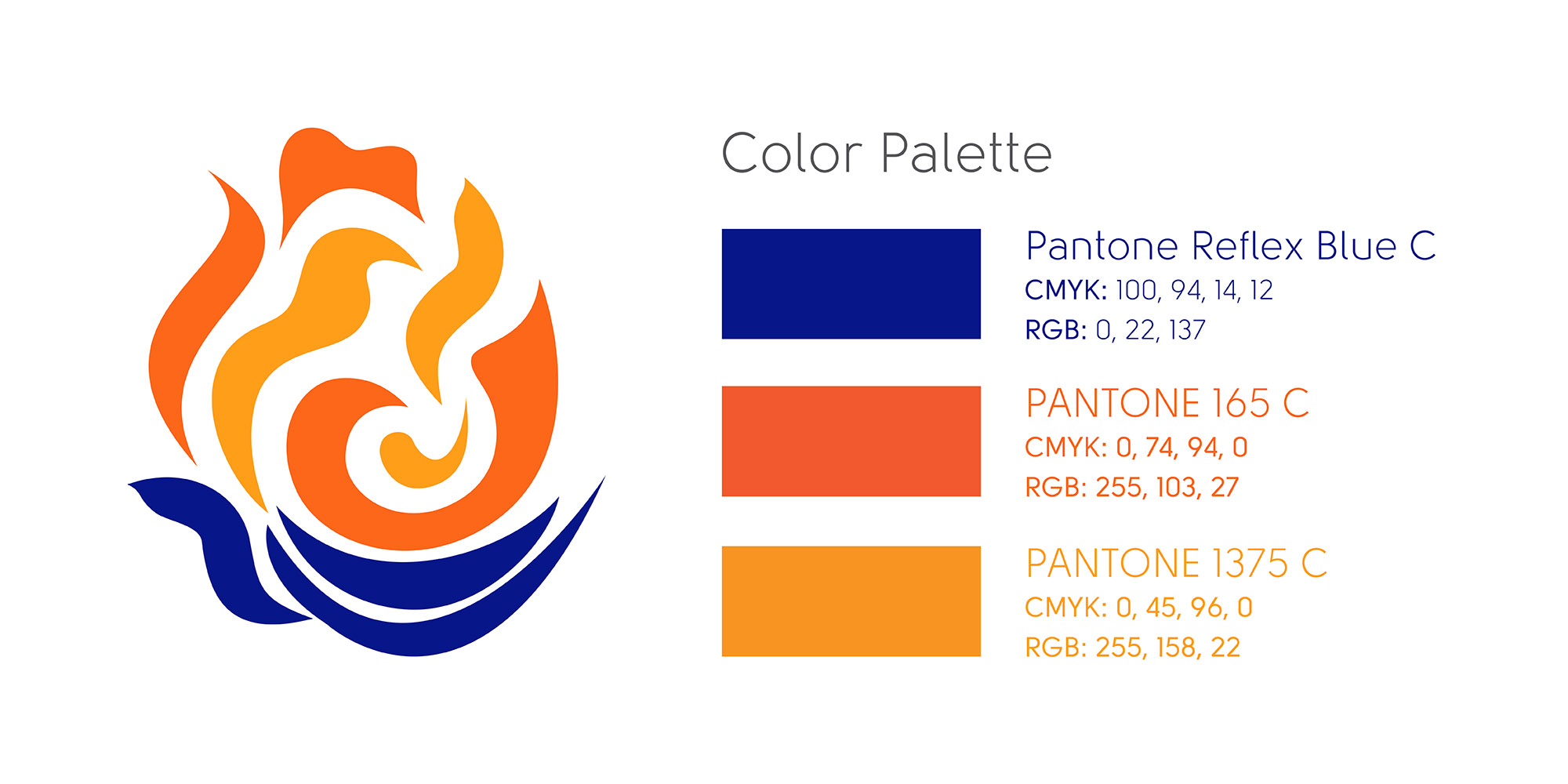
The final logo reflects the simplicity and beauty of the two elements as they dance, and when used, the text serves as a grounding element for the icon. Although subtle (and likely unnoticed by most), the link to Rose of Sharon is present and undoubtedly appreciated upon discovery.
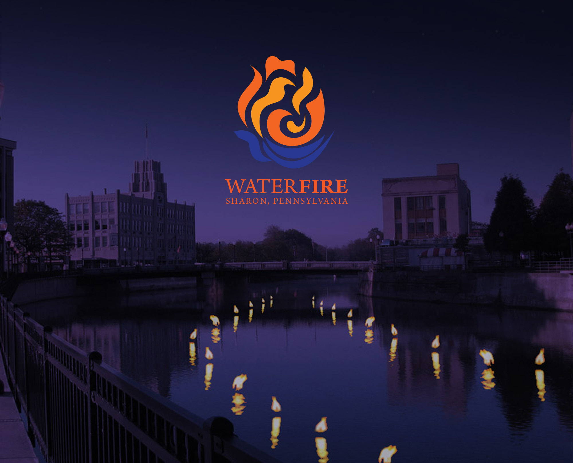
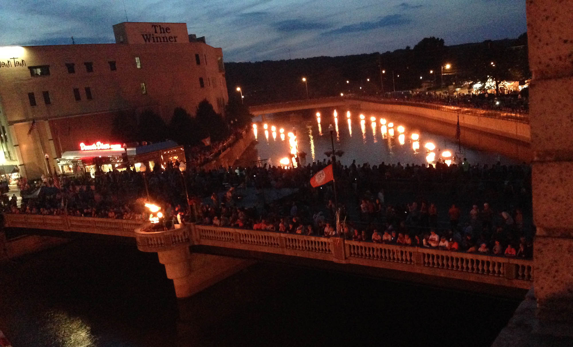
Pictured above is mockup I created prior to the first WaterFire event of the flames dancing along the Shenango River. This image was used in the presentation of the final logo concept to the board of directors.
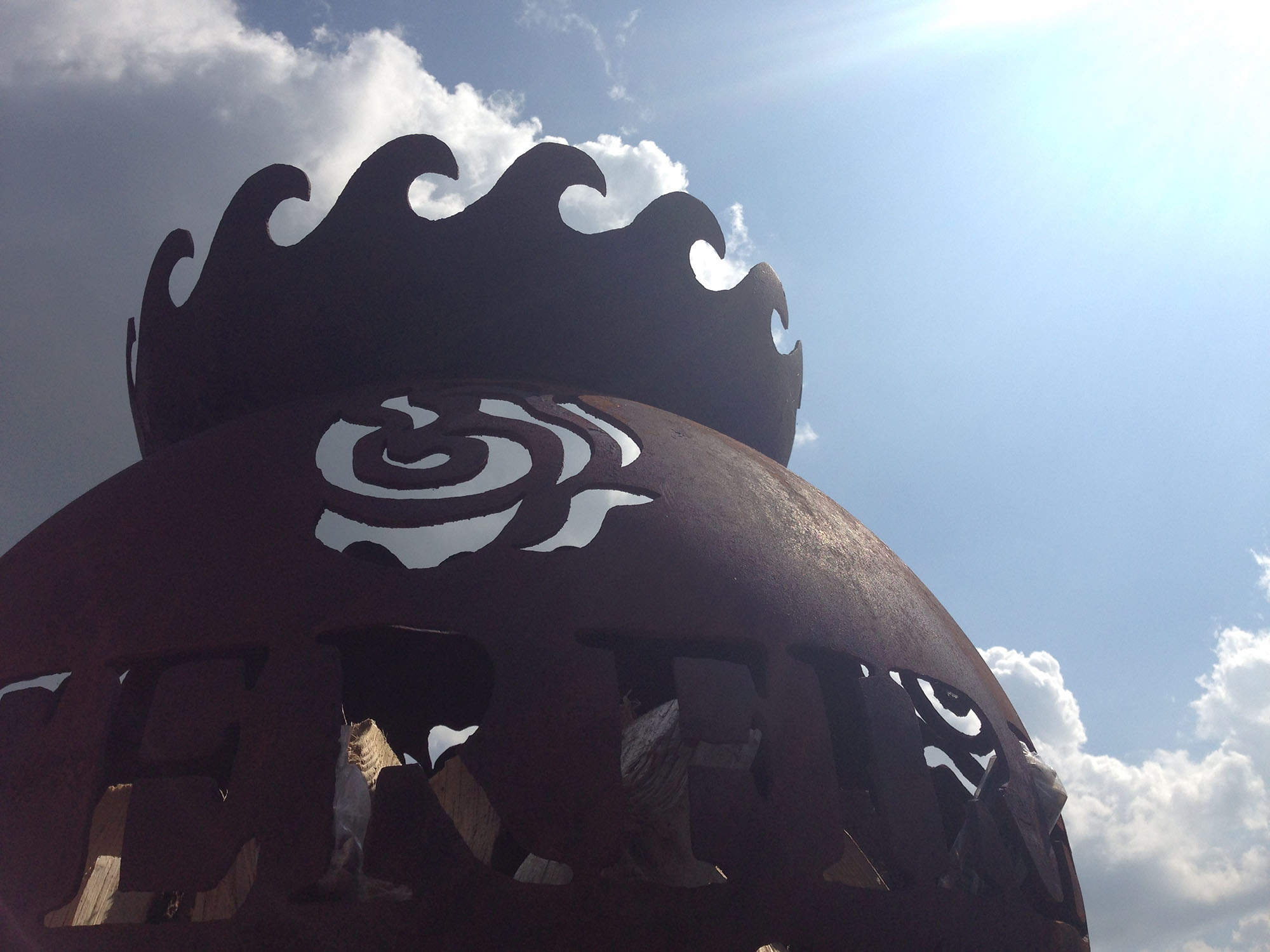
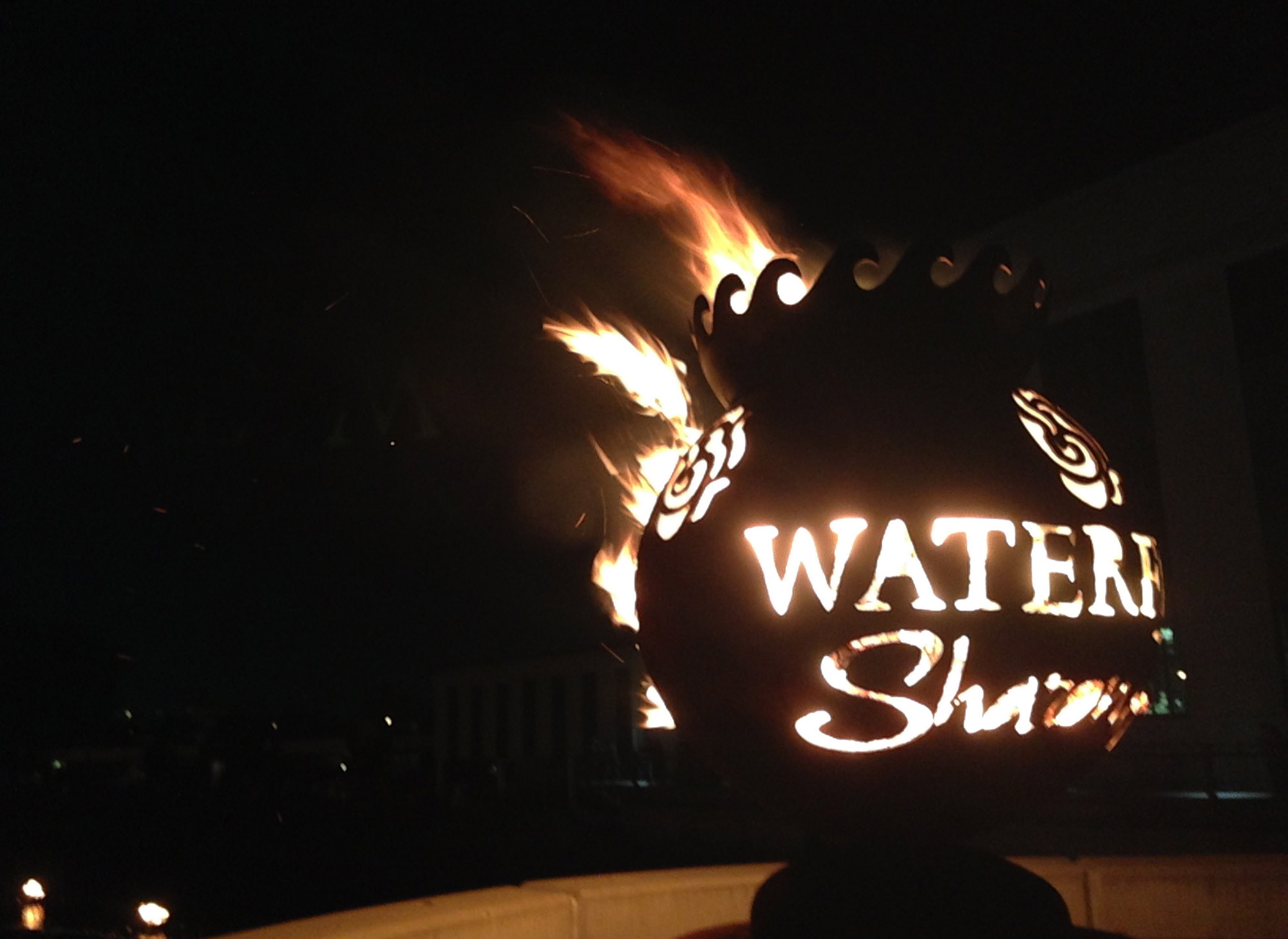
The foundation kicked off the second WaterFire season by unveiling this brass caldron branded with the logo on the bridge that serves as the central viewing point. Now at each lighting ceremony, the torch bearers pass flames down opposite ends of the river, coming together to light the central caldron. The branded caldron is now a permanent fixture on the bridge in downtown Sharon and reflects the success and spirit of the event and community.
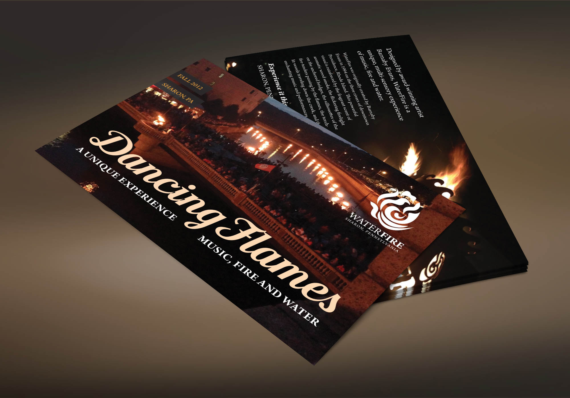
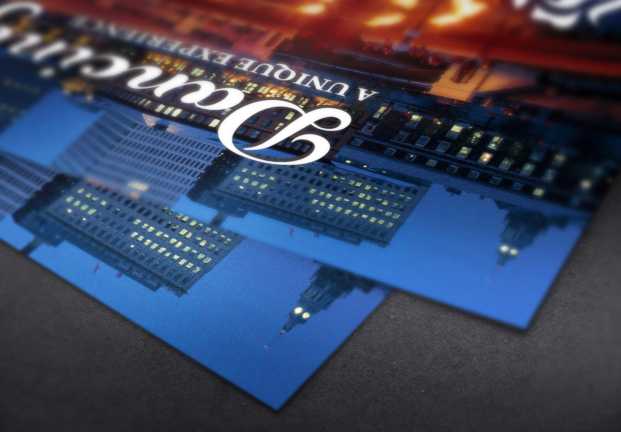
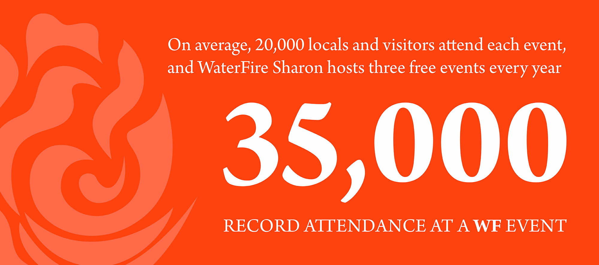
A promotional piece created for the logo concept presentation. My goal was to illustrate how a knocked out version of the logo worked on top of a photograph, adding a new dimension of possibilities for the logo when elements of a photo appear through the design.

